
 Hey Guys,
I couldn't hold back the graphic designer within....
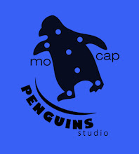
I just quickly did up these 3 ideas for our logo... feel free to make suggestions - or make one of your own! These came into my head and I thought I may as well show them to you guys to see what you think.
Thanks!
Stace


6 comments:
I actually like the 1st one best! It looks like hes in a really awkward position, and that sorta goes with our name, making fun of how absolutely stiff and awkward mo cap is. Maybe even wonkify him more?
Yeah, that was the last one I did and I liked it the best, mostly because of the pose.
Wonkifying him more is always a possibility....!
I think I'm most partial to the first and last. First one looks most awkward, but I do like the last guy's sign he's displaying so proudly...
I do enjoy the sign as well.....
He is proud of it.
Perhaps we can have a vote or something at the next meeting...
i like the first one too the most,and maybe like brock said we should wonkafy him abit
I really like the first one!! I've got to say I love how the wording is on it. Definetly the best. But I think he should be practically falling over! but I love the wording on it keep that!! lol
Post a Comment